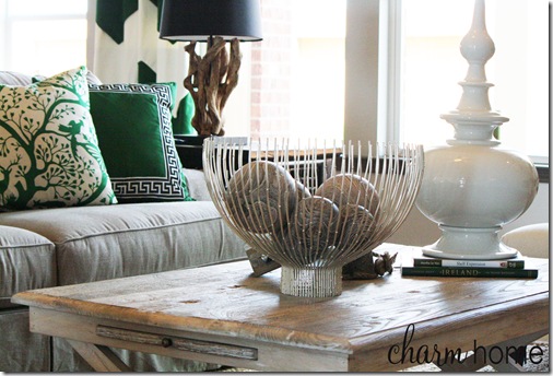
last week i shared my latest design project with you all. today i thought it would be fun to give you a little insight into my inspiration for the design.
i think the most common question that i’m asked as a designer is “where do you get your inspiration for your designs?” my design inspiration can quite literally come from anywhere. sometimes i’m inspired by nature, sometimes it’s a piece of fabric that inspires me, sometimes it’s a picture from a magazine or catalog and sometimes it’s something that i’ve seen in a store. i could go on and on but you get the idea. this house was a combination of sorts. the color palette was inspired from a home that i had seen which was photographed by blayne beacham. i loved how the main colors were black and white with pops of different colors in each room. {inspiration home seen below}


{photo credit for above photos – blayne beacham}
although i loved the black and white combo i had to tweak it slightly due to the finishes that the builder had selected for the model home. the finishes were all earth tones so i decided it would be best to use neutral tones (natural linen, charcoal, and white) as the base and then deepen the accent colors in each room.
next, i had to figure out what the style of the home would be. i absolutely love the store south of market and really took my style inspiration from that store. i really wanted the model to have a very classic style with rustic and unexpected elements thrown in.
it was a little hard to pull this look off because i had a strict budget, but by keeping my accessorizing to a minimum i was left with more money to put towards some really amazing pieces of furniture.
kids’ rooms
i’m sure you can all guess where the inspiration for the room below came from.

all of the furniture for this home was shipped in on palettes so i just used one of the larger palettes for my queen size headboard. the main difference between my room and the inspiration room is that i designed my room for a teen and the inspiration original room is for a young boy. lakeitha over at home to three duncan boys also did a fab job at interpreting this room. it’s interesting to see the differences in both of our rooms.
for the twin girls’ room i really wanted to do something fun and yellow stripes on the ceiling were a perfect way to add a little whimsy to the room.
then i found these really cute purple felt pillows at homegoods and decided the main colors would be shades of purple and yellow.
i hope this gives you a little more insight on how a design is developed.


0 comments:
Post a Comment