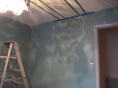
After a long search for wallpaper for the nursery walls, then wallpaper for the ceiling we decided to paint the ceiling. I went through several designs (these were just the beginning).....

I could have (and might have, ahem) gone a little crazy with the design but since Patrick volunteered to take on the challenge we decided to keep it somewhat "simple"- straight lines.

 I knew I wanted to do tone on tone and gray, but after that I was relatively open to the exact shade. We had trim paint left over so I decided to use that as the darker color. I also liked that is was a gloss finish, something unexpected since the lighter color was an eggshell finish
 I know the light fixture above was a favorite of many of you but don't worry, it went to a good home- our guest bedroom (which reallllly needed it). For the nursery light I knew what I wanted from the moment I saw it a year and half ago at Market.
 I instantly loved the whimsical feel of the recycled styrofoam fixture but I knew it would have to be the right room. When we found out we were pregnant I knew just where it would find a home.
I know it is a little out there, a sentiment many, including the electrician, have conveyed to me but I could not love it more. It is unique and adds a playfulness the room needed.
Here is a picture of the full ceiling and light.

No, it is not your eyes playing tricks on you, it does look like the lines to the right are slightly uneven. I can assure you, after hours of taping, leveling and measuring the lines are perfect. It turns out that sometimes you don't know you have a huge dip in your ceiling until you decide to draw attention to it. C'est la vie.

 So while I do still dream of wallpapered ceiling I could not be happier with the way things are looking overhead.


0 comments:
Post a Comment