From the moment I found out I was pregnant, I’ve been scouring the blog world for inspiration for my own nursery. Right before the new year, designer Sherry Hart of Design Indulgence revealed pictures of a nursery that she designed for a client. I stopped dead in my tracks when I saw Baby G’s nursery. It was love at first site for me from the rustic barn doors to the Ouef Sparrow crib to the rocker with nail-head detail. This nursery is truly a work of art.
I knew I wanted to find out more about the creation of this design so I interviewed Sherry herself to see what her thought process was and get some inside details on the design.
To get an idea of where sherry’s inspiration came from, you have to know that this nursery was previously a guest room. About four years ago Sherry designed a family’s home in the Virginia Highlands area of Atlanta in only three weeks. You can see pictures of this home which was actually featured in Better Homes & Gardens on her website here. The guest bedroom isn’t pictured on Sherry’s website, but the inspiration for it was based off of a bold yellow and white Raoul Textiles fabric [it can be seen on the small chair in the nursery] that Sherry had seen in a showhouse that Kay Douglass designed. She then found the rustic barn doors that were originally used as the guest bed headboard, now used as the backdrop for the crib, at an antiques store here in Atlanta.

Sherry: I knew that Mande and Joe wanted a very un-nursery look. We decided to leave the barn doors and place the crib against it. They had their heart set on that crib :)
Charm Home: One theme that is subtle but seems to flow throughout the nursery is animals. I’m curious, which animals came first?
Sherry: The first animal was the paper mache [gazelle] head from Anthropologie. I actually went to Lewis and Sheron Textiles and pulled a few fabrics to show her what my thoughts were...I was hoping she would like the animal prints. We did the shower curtain first. That got her excited! After we hung the shower curtain I think she felt better about adding some more babyish fabrics. In came the larger animal pillows. Then the gray geometric for the crib skirt. I found the animal prints on etsy framed them with Ikea frames.

Sherry: She [the client] found the chair at Scotts and sent me a picture to see if I liked it and if it could be cute recovered. I said yes and yes!
Charm Home: I love it when designers use furniture pieces other than changing tables for their changing area. I see you’ve done that exact thing here.
Sherry: When we started thinking about a changing table I showed her how I had seen the Ikea shelves turned sideways....again...a picture is worth a thousand words.

Sherry: The Raoul fabric that was first on the guest room pillow and is now on the accent chair is how we came up with the paint color on the ceiling. Originally we had a big brown drum light in the room but we had gotten that basket at Scott's for 75.00 and her husband made the light out of it.
Charm Home: Very often the charm of a design is in the details and the accessories that are added as finishing touches. This definitely rings true in Baby G’s nursery. Can you tell us where some of these adorable accessories are from? It looks like many of them aren’t actually from a baby store.
Sherry: The bike, orange aardvark in the crib and the block letters are from the Seed Factory. The mobile on the barn doors is Christmas decor from West Elm, but I don't think it looks very Christmassy. The Chalk/magnet board came from a yard sale for a $1.00. The abacus came from CB2. And, the white painted chair she [the client] found on the side of the road!
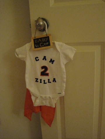
One last shot…WAR EAGLE!!! This baby knows his stuff.
~~~~~~~~~~~~~~~~~~~~~~~~~~~~~~~
I’m sure that Baby G is going to love this nursery that you’ve designed for him. And, I’m even more sure his mommy and daddy are just thrilled with this lovely space. Thanks so much for sharing such wonderful insights on the design process with us!
Links:
Sherry Hart Designs, Anthro Gazelle Head, Animal Print Fabric, Animal Art, Seed Factory, Abacus
*all images via Design Indulgence


0 comments:
Post a Comment